M City’s tribalizing promise is music to new Mississauga’s ears
M City’s tribalizing promise is music to new Mississauga’s ears
L.A., Inc.’s “M City” brand and “New Mississauga” campaign tap into the civic pride of Mississauga’s residents. The campaign’s artwork pays tribute to a young, mobile and diverse demographic eager for a downtown district that’s as mixed, vibrant and urban as it is. By Lawrence Ayliffe & Austin Macdonald
Executive Summary:
Mississauga, Canada’s fourth largest city, is multilingual and skews young. Municipal officials just approved a community-scale residential development project being undertaken by Rogers Real Estate Development Limited and Urban Capital. Called “M City”, it will be a pedestrian- friendly urban district centred around a large public park. When completed, the tight grid of walkable city blocks will be part Mississauga’s rapidly intensifying downtown core. In order to build their community’s base and effectively reach out to Mississauga’s savvy, diverse and youthful makeup, M City’s first ad campaign zeroed in on citizens of the New Mississauga and updated the identities of whom these urbanites may actually be.
About:
Rogers Real Estate Development Limited and Urban Capital have teamed up to execute an expansive master plan for Cleary Park District at the southwestern extremity of Mississauga’s City Centre. In March 2017 they will launch the first phase – a 60-storey point tower with an expansive podium that will define the new neighbourhood’s first city block. If all goes according to plan, the ensuing 15-acre, 15,000-resident, eight-block urban district will be widely known as M City and will be the first part of Mississauga’s central core that looks the part of a downtown. It will feature high-rise residential towers, a large urban park and shop-, townhouse- and tree-lined streets. By specifying a high-density, pedestrian-friendly, human-scale for the phases’ ground floors and neighbourhood’s streetscapes, M City’s urban planners have outlined the future of somewhere that will give New Mississauga’s residents (M-people?) not only a place “to be from” but also a place “to be.”
Mississauga is young and diverse: 20- to 44-year-olds make up approximately 40 percent of its population of 700,000. The current
downtown core is a mix of shopping, post-secondary campuses and cultural venues with growing community amenities, mass transit nodes and alternative transportation options for residents. A suburban city on the verge of becoming an urban setting, Mississauga’s ongoing growth has come from decades of immigration and it has large, long-established populations of European, South Asian, Chinese and Caribbean descendents. Perhaps contrary to popular belief, many of Mississauga’s residents grew up, live and work there, a fact that stokes a considerable amount of latent civic pride.
While many may have grown up in Mississauga’s bedroom-community settings, the younger generation ofNew Mississauga that has recently come of age is looking to escape the cul-de-sac and has a pent up demand for something new, contemporary and uniquely theirs. To this day, Mississauga still lacks a truly urban environment that’s post-car and post-mall.
Challenges:
Rogers and Urban Capital asked L.A., Inc., their advertising agency: “So. How do you launch a large-scale, decade-long, multiple-phase, residential development?”
Charged with winning Mississauga’s mind-share for the new urban district, the ad agency’s creatives knew the real estate brand would have to be highly-relevant and tightly-dialled-in to connect with this multi-faceted, local demographic.Given the development’s extended timeframe, the new name would have to have an enduring quality. At the same time, in order to be memorable, it would need a certain immediacy. Lastly, the brand would have to promise lifestyle, something aspirational and visionary.
Introducing M City
Revealed at the announcement of the first phase, “M City. Mississauga’s future starts here.” is L.A.’s name and community-centric branding for this new urban district.
The name is a catchy short-hand and highly hashtagable. It speaks to locals, as a familiar and endearing hometown nickname and explicitly confers city-dom on Mississauga’s downtown core. Ultimately, “M City” has the potential to be very powerful should the name go viral or leak into the local slang as the latest lingo for Mississauga itself.
At the same time and by way of differentiation from its surroundings, the name’s abbreviated nature also denotes something smaller than the whole. In this way, M City suggests how the district on the southwestern edge of Mississauga’s downtown will also be a city within a city, offering a distinct identity from the commercial core.
The logo’s multicoloured “M” hints at Mississauga’s varied make up. At a second glance, the colours are also a metaphor for the multiple mixed-uses, multitude of activities and many amenities that are implicit to the everyday of a downtown setting and accompany a pedestrian lifestyle.
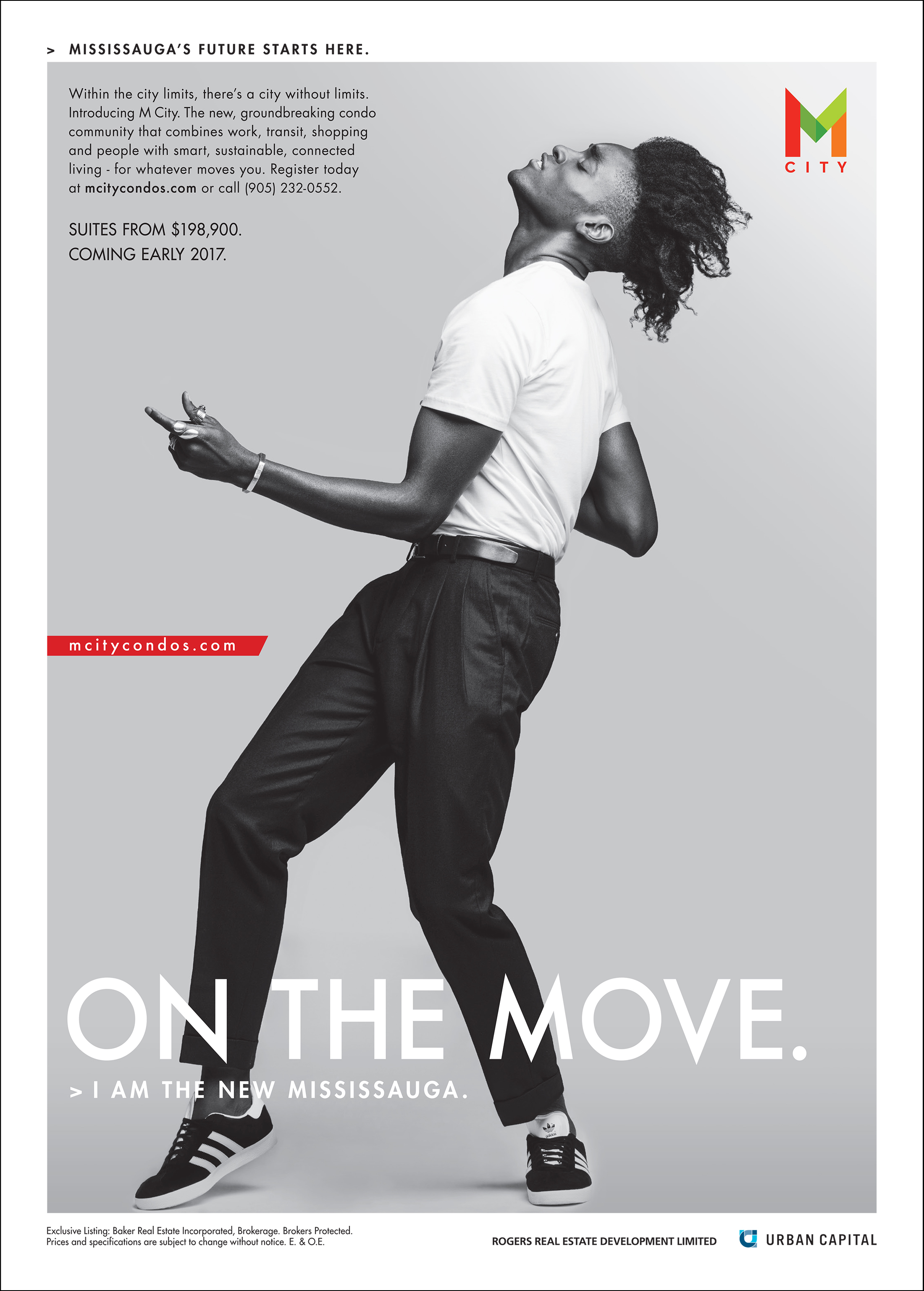
With the photography for M City’s first ad campaign about a New Mississauga, L.A. drilled down further into the city’s contemporary composition. The agency created eight personas that represent some of the faces of local residents. Each of the images is of a different character, including a fashion designer, a startup founder and a maker. They’re all from different backgrounds. Despite their diverse appearances, the different instances of the ads have a unifying force and a cumulative effect. The subjects of these updated portraits of prototypical locals are unequivocal and unanimous about their identities—all seemingly declare “I am the New Mississauga.”
With the New Mississauga keenly in mind, M City’s intended audience for the slogan “Mississauga’s future starts here” begins to crystallize. It positions the new project as a likely site for these like-minded denizens to meet on common ground in their own distinctly urban downtown. UC

